Category Archives: European culture

Tracing sensibilities worldwide: two recent discoveries

A large part of my wiki is about tracing certain sensibilities around the globe. Recently, I made two discoveries which ‘opened’ Portugal and Belgium for me.

I found – what I believe to be – the Portuguese equivalent of Western publishing houses Losfeld, Pauvert, Olympia in France, März in Germany, Calders & Boyars in the UK or Grove Press in the U. S. : Edições Afrodite run by Fernando Ribeiro de Mello. Most of the info comes from the Portuguese Wikipedia and much of it still needs to be translated. My Portuguese is limited, so any help is welcome.

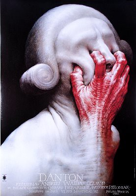
Quite a wonderful cover:

Textos Malditos

Textos Malditos, an Edições Afrodite edition

Freddy De Vree

Rita Renoir, enz.

In Belgium I found Freddy de Vree, Belgian intellectual, cult figure and companion to Sylvia Kristel in the last years of his life. He was a friend of Topor and W. F. Hermans, wrote critiques on such diverse topics as Pigalle stripteaseuse Rita Renoir or French ‘excremental’ philosopher Georges Bataille.

Below are two images from De Bezige Bij editions of Hermans’s King Kong by publisher De Bezige Bij, of which I found the graphics amazing. De Bezige Bij, an interesting Dutch publishing house.

Two very impressive Bezige Bij covers:

King Kong WF Hermans

King Kong

King Kong WF Hermans 2

King Kong tweede druk

De Bezige Bij also published De Vree’s book on W. F. Hermans: De aardigste man van de wereld.

I thought it would be nice to leave you with an image of Rita Renoir:

Rita Renoir

The tropes of the Polish film poster

Danton poster made  in 1991 by Wiesław Wałkuski, for a 1983 film by Andrzej Wajda

It seems that my current interest in the work of Polish-French artist Roland Topor brings me again to the work of the Polish film poster makers. Their work is fantastic, figuratively and literally. Why is it that graphic design is at such a qualitative height in Poland. And why is it that their work is so unbelievably strange?

The tropes of the Polish film poster school are the fantastique, grotesque, weird, uncanny: pierced and punctured bodies, cut-out figures, dismembered limbs, independent body parts, eerie physicality and visceral transparency.

As to the why, the site owner of Polish film posters has an explanation:

A lot of patronizing drivel had been written about the ‘Polish School’ of poster design being a ‘product’ of a ‘resistance to Communism’ or some such (and by extension, of an overwhelming desire to breathe free under the learned guidance of a Bushmonkey-on-a-cheney). That view, espoused by Western writers who don’t know any better, and Polish ones (who should know better) has been omnipresent lately. No matter that the idea of art as an expression of political circumstance is par excellence a classic communist one.

In fact, quite the opposite seems to be true : free from commercial stranglehold, these artists produced brilliant works over an extended period of time. A lot of talented people found themselves in the right place at the right time. Like any artistic movement (or ‘school’), it had its own dynamics, peaks and valleys. Indeed, some of the most accomplished works were political (pro-socialist). And now the fact that Polish film poster is dead (and had been so since 1989 when the film distribution was privatized) is further evidence of that.–http://www.cinemaposter.com/index.html

As an encore I give you one more poster with the theme of independent body parts:

poster by Lech Majewski 1977 for Le Mouton enrage (1974)
sourced here.

About 500 more movie posters of the same site here.

I’ve reported on the paratextual qualities of the film poster here.

Experience is like a comb to a bald man

[Youtube=http://www.youtube.com/watch?v=tMFymZJWaEE]

Roland Topor portrait by Frantz Vaillant of Topor et moi.

Question: I was looking into the love life (cherchez la femme) of Roland Topor (who I consider the finest draftsman of the twentieth century) but could find nothing. Has there been a Topor biography? Yes there is, by  Frantz Vaillant.

The grotesque, the fantastique, niche marketing and printmaking

The Waking dream: Fantasy and the surreal in graphic art, 1450-1900 (1975) – Edward-Lucie Smith [Amazon.com] [FR] [DE] [UK]

My purchase of Quatre siècles de Surréalisme brought me back to the book pictured above (which I do not have in my possession, but which I feel covers the same terrain as Quatre siècles, please correct me if I am mistaken, in fact I believe the link between both books is French art historian Aline Jacquiot), of which Paul Rumsey says:

The tradition of the grotesque is particularly alive in prints. The fantastic is especially suited to the graphic medium, and it is possible to track almost its entire history in etchings, engravings and woodcuts. A fine book The Waking Dream: Fantasy and the Surreal in graphic Art 1450-1900 charts this progress through Holbein’s Dance of Death, the macabre prints of Urs Graf, the engravings of Callot, seventeenth-century alchemical prints, scientific, medical and anatomical illustration (I adapted the embryonic development diagrams of Ernst Haeckel for my drawing Species/Gender), emblems, the topsy-turvy world popular prints, Piranesi’s Prisons (which influence my architectural fantasies), Rowlandson, Gillray (whom I studied for guidance on how to draw caricature for drawings like my Seven Sins) , Goya, Fuseli and Blake, and into the nineteenth century with Grandville, Daumier, Méryon, Doré, Victor Hugo’s drawings and Redon. The tradition continues with the Symbolists and Richard Dadd, Ensor and Kubin, through to Surrealism, which recognised many of the artists of the grotesque and fantastic tradition as precursors. It is via Surrealism that much of this work has come to be appreciated. In the twentieth century this type of imagery has permeated culture, and is found everywhere, in diverse art forms including: the satiric installations of Kienholz, the drawings of A. Paul Weber, the cartoons of Robert Crumb, the animated films of Jan Svankmajer, photographs by Witkin, plays by Beckett, science fiction by Ballard, fantastic literature like Meyrink’s The Golem, Jean Ray’s Malpertuis, the art and writings of Bruno Schulz and Leonora Carrington, films by David Lynch, Cronenberg and Gilliam; all are part of a spreading network of connections, the branching tentacles of the grotesque. — Paul Rumsey

The significance of printmaking vs. oil painting is that of mechanical reproducibility. A print has always been much cheaper than an original, thus more democratic, thus more fantastic (it has to please fewer people, can address itself to niche markets), thus more nobrow.

Parisian “book hell” open to public

Dessin d’un boudoir () – J. J. Lequeu

Three days ago, I reported that it was Jean-Jacques Lequeu‘s 250th anniversary. My good friend Dominique alerted me that the Parisian “enfer” will open its doors from December until March of next year. This will be a unique opportunity to see books and illustrations which have been hidden from the general public for more than 170 years.

Enfer is French for hell. In this instance it refers to the private case of the French national library. The contents of this library were cataloged by Pascal Pia and Guillaume Apollinaire in the 1913 Les livres de l’Enfer, and in 2007 the “Enfer” will be shown to the public in an exhibition titled Eros au secret. Children are not admitted.

I hope this will be an impetus for other European libraries to do the same. Let the gates be opened of all private cases, Giftschränke and Remota.

View the original French advertisement here and my entry Eros au secret.

Lequeu’s 250th anniversary

‘Le grand baailleur [sic],’ drawing by J-J Lequeu, from between
1777-1824 (Eng: the big yawner)

Jean-Jacques Lequeu (Rouen, September 14 1757 – 28 March 1826) was a French draughtsman and visionary architect. Today is his 250th anniversary.

Born in Rouen, he won a scholarship to go to Paris, but following the French revolution his architectural career never took off.

He spent time preparing the Architecture Civile, a book intended for publication, but which was never published. Most of his drawings can be found at the Bibliothèque nationale de France. Some of them are sexually explicit (Le Dieu Priape [1] (ca. 1779 – 1795) which shows a rather large male phallus and Trois images du sexe féminin) and are kept in the Enfer of the library. Most of these drawings have been reproduced in Duboy’s book but can also be found in Sade / Surreal.

Così fan tutte

All Ladies Do It/Così fan tutte (1992) – Tinto Brass [Amazon.com]

Così fan tutte, ossia La scuola degli amanti, (Eng: “They all do it” or “They are all like that”) opera buffa by Wolfgang Amadeus Mozart and a bawdy film by Tinto Brass. Mozart took as a theme “fiancée swapping” which dates back to the 13th century, with notable earlier versions being those of Boccaccio‘s Decameron and Shakespeare‘s play Cymbeline. Elements from Shakespeare‘s The Taming of the Shrew are also present. Furthermore, it incorporates elements of the myth of Procris as found in Ovid.

Although the title is usually translated into English as “They All Do It”, Italian speakers will notice that the word “Tutte” has a feminine ending on it. The title can thus be translated as “All Women Do It” (i.e. cheat), or even “Women are all the same”.