Category Archives: design

RIP Tom Wilkes (1939 – 2009)

RIP Tom Wilkes (1939 – 2009)

via www.munciefreepress.com RIP Tom Wilkes (1939 - 2009) He won a Grammy Award for the Who’s “Tommy”[1]. He was also known for designing the cover art for hit albums by artists like Neil Young (Harvest[2]), George Harrison and the Rolling Stones (Flowers[3], Beggars Banquet[4]) and many more. In 1967 Wilkes was the art director of the Monterey International Pop Festival. He created all graphics and printed materials for Monterey Pop, including festival’s psychedelic poster[5].

Rare poster to the Monterey International Pop Festival

Tom Wilkes (born July 30, 1939 – June 28, 2009) was an American art director, designer, photographer, illustrator, writer and producer-director.

He won a Grammy Award for the Who’s “Tommy[1]. He was also known for designing the cover art for hit albums by artists like Neil Young (Harvest[2]), George Harrison and the Rolling Stones (Flowers[3], Beggars Banquet[4]) and many more.

In 1967 Wilkes was the art director of the Monterey International Pop Festival. He created all graphics and printed materials for Monterey Pop, including festival’s psychedelic poster[5].

tip of the hat to http://themusicsover.wordpress.com.

Introducing Harry/i Peccinotti

penguin75_frontcover by bsjohnson_info.

Penguin Modern Poets 25 also features a photograph of female lips smoking a cigarette, one of his trademark image tropes.

The Woman of Rome by Moravia by you.

Alberto Moravia‘s 1976 Penguin edition of The Woman of Rome

I haven’t properly introduced Harri Peccinotti, the man celebrated in the previous post on Nova magazine.

Harry Peccinotti (born 1938, London, UK) is a photographer and art director. He was Nova magazine‘s first art director and regular photographer throughout. He also did the Pirelli Calendars of 1968 and 1969, with designer Derek Birdsall.

He also provided the cover photograph for Alberto Moravia‘s 1976 Penguin edition of The Woman of Rome and contributed photographs to The Beatles Illustrated Lyrics.

Penguin Modern Poets 25 also features a photograph of female lips smoking a cigarette, one of his trademark image tropes.

He has designed record sleeves for Esquire Records.

He is still working with fashion stylists such as Charlotte Stockdale and Antje Winter.

Happy birthday Luigi Colani

The earth is round, all the heavenly bodies are round; they all move on round or elliptical orbits. This same image of circular globe-shaped mini worlds orbiting around each other follows us right down to the microcosmos. We are even aroused by round forms in species propagation related eroticism. Why should I join the straying mass who want to make everything angular? I am going to pursue Galileo Galilei’s philosophy: my world is also round. — Luigi Colani.

Car Styling 23 Luigini Colani special by you.

[Amazon.com]
[FR] [DE] [UK]

There is one available now at Amazon.de, 69 EUR.

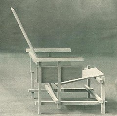
European designer Luigi Colani turns eighty today.

I can’t remember the first time Colani came upon my radar, but it must have been in the various design books I read in my twenties, this was in the 1985-1995 period. He – and his celebration of curvilinearity (one of the faultlines in 20th century art) – remain paramount in my design canon.

Modern and contemporary designers in this tradition include Friedensreich Hundertwasser, Isamu Noguchi, Carlo Mollino and Marc Newson.

Connecting keywords are non-Euclidean geometry, ferrocement, organic design. [I must look into this non-Euclidean geometry thing, some interesting connections are bound to appear]

Also of interest is the survey of Eric Hunting, ‘The Classic Rock Realm of Ferro-Cement’[1].

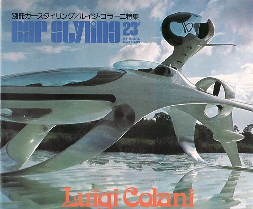
Around that same period I bought a monograph of Colani’s work, a special issue of Japanaese Car Styling magazine, #23. Personally, I prefer his non-car styling designs and the issue of Car Styling aforementioned features some rare works of eroticism (ceramics, photography, drawings) and sanitary ware by Villeroy and Boch.

The cover of that magazine is noticeable for its Böcklin typeface.

Previously on Jahsonic: Lost and found: biomorphism

Icon of Erotic Art #31

It is time for Icon of erotic art #31

Truck Babies (1999) by Patricia Piccinini

Truck Babies (1999) by Patricia Piccinini presents a pair of infant trucks. It is Icon of Erotic Art #31.

“The Truck Babies are infantile not miniature; they have big cheeks and fat bottoms, little wheels and lovely big eyes. They are what I imagined to be the offspring of the big trucks that I saw on the road. I examined the relationship between babies and fully-grown animals and people and applied these developmental changes backwards to the trucks.” [1]

The eroticism of this work is not obvious, but derives from the fact that most procreation is derived from the sexual act. It is my basic tenet that the sexual act is not necessarily “natural“, my favorite quote in this regard is from Leonardo da Vinci:

“The art of procreation and the members employed therein are so repulsive that if it were not for the beauty of the faces and the adornments of the actors and the pent-up impulse, nature would lose the human species.”

A quote that also comes to mind is one by Susan Sontag:

Human sexuality is, quite apart from Christian repressions, a highly questionable phenomenon, and belongs, at least potentially, among the extreme rather than the ordinary experiences of humanity. Tamed as it may be, sexuality remains one of the demonic forces in human consciousness – pushing us at intervals close to taboo and dangerous desires, which range from the impulse to commit sudden arbitrary violence upon another person to the voluptuous yearning for the extinction of one’s consciousness, for death itself.” –Susan Sontag in the The Pornographic Imagination

The sexual act requires humans to gain intimacy to body parts which are “naturally” abhorred by humans, body parts which involve excrementation for example.

The sex drive, to which near all human animals fall prey, has often propelled us to engage in the sexual act with non-human animals. I surmise that the depictions of human-animal hybrids featured in bestiaries so popular in the Middle Ages (only second in popularity to the Bible), is derived from the fear that human-animal copulation would result in offspring.

It is within the context of these bestiaries that the work of Piccinini should be viewed. The uncanniness of Truck Babies is derived from a fear of ascribing animal qualities to machines, machines having become the nearest equivalent to domestic animals in the post-industrial age.

Truck Babies also provides me with an opportunity to announce the death of American science fiction writer Thomas M. Disch (1940 – 2008), author of Camp Concentration, The Brave Little Toaster and 334. The oblique link between Truck Babies and Disch is the anthropomorphism evident in Truck Babies and The Brave Little Toaster.

Rietveld @ 120

Gerrit Rietveld (June 24, 1888June 26, 1964) was a Dutch furniture designer and architect.

Onbeschilderde_Rietveldstoel

Leunsteul van Rietveld. Circa 1918. Published in De Stijl, second year, number 11 (September 1919). Photographer unknown, so copyright expired on 1-1-1990.

Rietveld designed the Red and Blue Chair in 1917, but changed its colors to the familiar style in 1918 after he became influenced by the ‘De Stijl‘ movement

Rietveld chair

Picture of a replicum of the Red and Blue Chair designed by Gerrit Rietveld. Picture taken by Wikipedia user Ellywa, with permission of the owner of the chair.

See also Dutch design, modernist design.

The energy of art

No-Stop City, Interior Landscape, 1969

No-Stop City, Interior Landscape, 1969 by Archizoom Associati

It was American experimental musician Rhys Chatham who first pointed out that the energy of art is always equal (except in periods of extreme hardship such as famine and war, where production tapers off), but has at the same time the tendency to displace itself. In music for example, the energy in the 1950s was in rock and roll, in the 1980s it was to be found in house music and techno.

The energy in international design in the late 1960s and early 1970s was clearly to be found in Italy. Displayed above is No-Stop City, a “radical design” architectural project by Archizoom Associati first introduced to the public in 1969. It is a critique of the ideology of architectural modernism, of which Archizoom felt that it had reached its limits. The artistic discourse of that era was buzzing with the term neo avant-garde, in a period that corresponds with Late Modernism or early postmodern art. The term neo avant-garde was rejected by many, but the term can be interpreted to refer to a second wave of avant-garde art such as Abstract Expressionism, Pop Art, Nouveau Réalisme and Fluxus.

If you want to read up on this period, please consult the following excellent volume:

The Hot House (1984) – Andrea Branzi [Amazon.com] [FR] [DE] [UK]

Prices in Amazon Europe are around 40€, in America starting from 12USD, a bargain.


Introducing Anton van Dalen

Anton van Dalen is a Dutch illustrator residing in the United States. He was during a period of 30 years the “secret” assistent to Saul Steinberg. His style is unique but reminds of Bracelli‘s work in the 17th century and its somewhat distanced pov feels a bit like Glen Baxter‘s absurd illustrations.

Here is a set of motor vehicle impressions via Bibliodyssey: [1] [2] [3] [4]

Bibliodyssey brought this set to my attention, if you are not already subscribing to his feed, you should. Since the demise of Il Giornale Nuovo, Bibliodyssey is the best hang-out for your daily dose of vintage visual culture.

For those of you unfamiliar with Bracelli’s work here is an example of his proto-surrealism:

From the Bizzarie di varie figure (1624) by Giovanni Battista Braccelli

From the Bizzarie di varie figure (1624) by Giovanni Battista Braccelli

Here is perhaps a better example, showcasing Bracelli cubism comparable to the one of van Dalen.

RIP Ettore Sottsass (1917 – 2007)

Unidentified photograph of Ettore Sottsass

Carlton Cabinet (1981) – Ettore Sottsass

Invitation to the first Memphis presentation, Sept 18 1981,

graphics by Luciano Paccagnella.
image sourced here

Ettore Sottsass Olivetti Valentine, first released on Valentine’s Day 1969.

Ettore Sottsass (14 September 1917 – 31 December 2007) was an Innsbruck-born Italian architect and designer of the late 20th century. He founded the Memphis Group and was a member briefly flirted with the Situationist International for a (very) short time. He was also connected to the radical design movement. His best-known product is the 1969 Olivetti Valentine typewriter. His 1981 “Carlton Cabinet” was to many people their first de facto exposure to postmodernism.

Sottsass founded the Memphis Group, an influential postmodern Italian design and architecture movement of the 1980s. Memphis explored a visual language outside of the limiting canons of “good taste,” blurring the boundaries between “high culture” and mass-produced “ordinary” consumer goods.

Radical design developed in Italy in the late 1960s and early 1970s. It continued the tradition of using new materials and bold colours that began with Pop Art but also drew on historical styles such as Art Deco, Kitsch, and Surrealism. The main exponents of Radical Design were small groups of architects and designers who questioned Modernism and rejected mass-consumer culture. Key groups and designers of the Radical style include Superstudio, Archizoom Associati, UFO, Gruppo Strum, and Ettore Sottsass.

Headlessness, armlessness and dismemberment

[Youtube=http://www.youtube.com/watch?v=Kmb34upfAro]

A Night to Dismember is a film by Doris Wishman. The story is about a woman from a “cursed” family who is released from a mental facility, and soon dismembered corpses start turning up.

Excuse the lack of coherence in this post. I wanted to show you the trailer above (which is undoubtedly for a bad film) and shine the light on a Chinese contemporary artist I discovered by way of Lemateurdart. The artist is Liu Jianhua and he makes armless and headless porcelain female bodies in suggestive poses such as this one, this one, and this one. His work reminds of china by Luigi Colani such as this, and the bas relief hors-d’oeuvre plates produced in the seventies (no photo as of yet, check Designing Tomorrow in Car Styling 23, chief editor Akira Fujimoto, published September 1978).

I have been looking for host body

[Youtube=http://www.youtube.com/watch?v=V16K6yMWprk&]

I viewed Enki Bilal‘s film Immortal (starring Charlotte Rampling) over the weekend and liked it, although story-wise it’s not a very good film. It rendered the graphic novels which I was so crazy about when I was in my early twenties quite beautifully: the sense of futurism mixed with decay, high tech mingled with dirt which you will also find in Tanino Liberatore‘s RanXerox. The feeling of loneliness and of alienation, the wide open spaces and futuristic, multi-level cities, the cast of humans mixed with “non humans” make for interesting viewing. However, if you can spare the time and the money, go for the original graphic novels.