Category Archives: modernism

Rietveld @ 120

Gerrit Rietveld (June 24, 1888June 26, 1964) was a Dutch furniture designer and architect.

Onbeschilderde_Rietveldstoel

Leunsteul van Rietveld. Circa 1918. Published in De Stijl, second year, number 11 (September 1919). Photographer unknown, so copyright expired on 1-1-1990.

Rietveld designed the Red and Blue Chair in 1917, but changed its colors to the familiar style in 1918 after he became influenced by the ‘De Stijl‘ movement

Rietveld chair

Picture of a replicum of the Red and Blue Chair designed by Gerrit Rietveld. Picture taken by Wikipedia user Ellywa, with permission of the owner of the chair.

See also Dutch design, modernist design.

Introducing Stan Vanderbeek

[Youtube=http://www.youtube.com/watch?v=1si3JxfYuBA]

Symmetrics (music credits anyone? Possibly Ravi Shankar?)

I don’t think I’ve mentioned American experimental filmmaker Stan Vanderbeek (1927 – 1984) on this blog. Today, I found his Symmetrics[1] of 1972 on YouTube. Vanderbeek is one of those artists I discovered in the post-internet days. Before the advent of YouTube this usually meant reading about him only, apart from the occasional still one might find on the net, such as this[2] very nice one.

Actually seeing Vanderbeek’s output on YouTube has proven to be very rewarding, especially after my disappointment in seeing much-read-about works Wavelength[3] by Michael Snow (born 1929) and that other overrated “structural filmSerene Velocity[4] by Ernie Gehr (born 1943).

These two last ones are deadly serious and devoid of any sense of humor; works such as Achooo Mr. Kerrooschev (1960) [5] by Vanderbeek are anything but that.

Click the numbers to see, hear.

If you like the work of Vanderbeek, you may also enjoy Len Lye.

Will you talk about yourself?

This post is part of the cult fiction series, this issue #5

The Swimmer (1968) Frank Perry

The famed John Cheever short story appeared in the New Yorker and people talked. Now there will be talk again. When you sense this man’s vibrations and share his colossal hang-up . . . will you see someone you know, or love? When you feel the body-blow power of his broken dreams, will it reach you deep inside, where it hurts? When you talk about “The Swimmerwill you talk about yourself?

Black Surrealism et al.

I may be a jackass

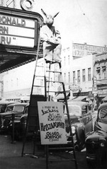
A “Jackass” sits atop a tall ladder in front of the Palmetto Theater to promote “Hellzapoppin” starring the comedy team of Olsen and Johnson. The sign on the ladder reads, “I may be a Jackass but I’m not coming down until Helzapoppin’ with Olsen and Johnson opens.” The film was released in 1941 by Universal Pictures. Via here

[Youtube=http://www.youtube.com/watch?v=Bmw7un31UR0&]

A Cadillac commercial by Dylan centered around Bob’s radio show

Spent yesterday evening in the vicinity of the Nachtegalenpark where I listened to The Faces, Nicola Conte‘s newest compilation but most of all to Bob Dylan‘s The Best of Bob Dylan’s Theme Time Radio Hour. Came home and got sick. Slept for more than 15 hours.

Woke up and thought about Black Surrealism, through my first exposure to the work of Slim Gaillard and his role in films such as the 1941 film Hellzapoppin’, of which Ado Kyrou was a fan. Black Surrealism is a concept first put forward by Robin D.G. Kelley in A Poetics of Anticolonialism (1999), although he had overlooked the popular dimension of the concept.

The popular strains of any art form are often forgotten, take for example Ma and Pa Kettle, the American comic duo known for their celebration of the absurd, but much less known and appreciated than comparable films by Jacques Tati (I am referring specifically to Tati’s attack on modernity which was just as prevalent in the Kettle films).

To conclude, a recommendation: if you only buy one CD in 2008, make it Bob Dylan‘s The Best of Bob Dylan’s Theme Time Radio Hour. You’ll enjoy tracks such as Mary Gauthier’s “I Drink”, Dinah Washington’s bawdy “Long Big Sliding Thing” and many more. Trust me.

The energy of art

No-Stop City, Interior Landscape, 1969

No-Stop City, Interior Landscape, 1969 by Archizoom Associati

It was American experimental musician Rhys Chatham who first pointed out that the energy of art is always equal (except in periods of extreme hardship such as famine and war, where production tapers off), but has at the same time the tendency to displace itself. In music for example, the energy in the 1950s was in rock and roll, in the 1980s it was to be found in house music and techno.

The energy in international design in the late 1960s and early 1970s was clearly to be found in Italy. Displayed above is No-Stop City, a “radical design” architectural project by Archizoom Associati first introduced to the public in 1969. It is a critique of the ideology of architectural modernism, of which Archizoom felt that it had reached its limits. The artistic discourse of that era was buzzing with the term neo avant-garde, in a period that corresponds with Late Modernism or early postmodern art. The term neo avant-garde was rejected by many, but the term can be interpreted to refer to a second wave of avant-garde art such as Abstract Expressionism, Pop Art, Nouveau Réalisme and Fluxus.

If you want to read up on this period, please consult the following excellent volume:

The Hot House (1984) – Andrea Branzi [Amazon.com] [FR] [DE] [UK]

Prices in Amazon Europe are around 40€, in America starting from 12USD, a bargain.


The Aporias of the Avant-Garde


Einzelheiten by Enzensberger

While I was in Amsterdam in the winter of 2006-2007 I asked the people in a philosophy bookstore: “If Slavoj Žižek and Sloterdijk are my two favorite contemporary philosophers, who would the third be?” They came up with Hans Magnus Enzensberger and Alain Badiou.

I had remembered Badiou but had almost forgotten Enzensberger, but last weekend at the used book store De Slegte I bought a Dutch translation of Enzensberger’s Einzelheiten, and was very much taken by his analysis of the concept avant-garde in his essay The Aporias of the Avant-Garde.

Aporias, published in 1962 in Germany, is one of the first essays that preached the “death of the avant-garde” which has been celebrated since the advent of postmodernism. It features good analyses too of Lukacs petty defense of literary realism and stimulating reflections on the absurdity of some critics’ grouping of individual artists into art movements, especially in cases such as expressionist literature (no writer has ever called himself expressionist).

On a general level it provides excellent etymological and semantic analyses of the term avant-garde.

P.S. Published in the same year was another work on avant-garde practices, which I suspect is more an eulogy: The Theory of the Avant-garde by Renato Poggioli.

The beneficial side-effects of censorship


Cover of the 1937 guide book to the Degenerate art exhibition.

Cover of the 1937 guide book to the  Degenerate Art Exhibition.

Nazi Germany disapproved of contemporary German art movements such as Expressionism and Dada and on July 19, 1937 it opened the travelling exhibition in the Haus der Kunst in Munich, consisting of modernist artworks chaotically hung and accompanied by text labels deriding the art, to inflame public opinion against modernity and Judaism. The cover the 1937 guide book (illustration top) features a sculpture of unknown origin. It could be Polynesian or any other tribal art work, please help me out here.

The sculpture clearly links modern art with primitivism.

This exhibition is also a perfect illustration of the beneficial side-effects of censorship. Beneficial in the sense that any attempt at banning works of art, books or other cultural artifacts results in an aide to discerning culturati to seek out these artifacts with zeal. Such has been the case with Video Nasties, the Index Librorum Prohibitorum (the Catholic Index) and the Degenerate Art expo mentioned above.

I once again repeat my question to you, dear reader: what is the origin of the statue depicted in the picture above. I thank  you beforehand for a reply.

Icons of erotic art #16

 Frontispiece by Fernand Khnopff for Joséphin Péladan’s Istar (1888)

Frontispiece by Fernand Khnopff for Joséphin Péladan’s Istar (1888)

Istar is a novel by Joséphin Péladan first published in 1888 with a frontispiece by Fernand Khnopff, depicting a woman, head thrown back in ecstasy and completely devoid of surrounding except for a phallic tentacled plant that grows toward her pubic area.

Eroticism 4/5, because of its “his hands were all over me” thematics first celebrated in icons #12 and 13.

Previous entries in Icons of Erotic Art here, and in a Wiki format here.

Icons of erotic art #9

Princess X, used here on the cover of Peter Webb’s The Erotic Arts (1975).

Constantin Brâncuşi‘s Princess X (1916) [1] is a representation of a phallus, although the artist – similar to a ploy used by Magritte in The Treachery Of Images when he said: “Ceci n’est pas une pipe” – himself always contended that it depicted the “eternal feminine”. Brancusi’s contribution to the Paris Salon des Indépendants of 1920, it provoked a quite a furor and had to be withdrawn following the intervention of the police.

Please excuse the uneroticism of this work, it seems the realm of “erotic art” is littered with unerotics. To make it up to you, let me give you some new Yoshifumi Hayashi from the excellent blog Banana Hole (this NSFW post is ambiguously amusing/disturbing), and a previously published one of the same artist by the ever reliable @mateurdart.

Lastly, some eye candy by Hajime Sawatari here from this series by this blog.