Category Archives: aesthetics

The eeriness of hanging, dripping mosses

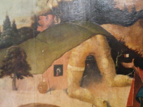
Following my previous post[1], Paul Rumsey identifies the mystery print[2] as one from the hand of Georg Lemberger, an Austrian artist so obscure he does not even have an English language Wikipedia page.

One of Lemberger’s paintings, Saint George Freeing the Princess (Lemberger)[3], has an Italian-language Wikipedia page, which I’ve partly translated and partly augmented:

The scene takes place in a fantastic forest. St George is preparing to face the monstrous dragon, hitting him with a spear, while the horse rears its head and front legs, according to the traditional iconography.

On the left the princess kneels in prayer.

Despite the small size of the work, it is emblematic of the role of landscape in the German art, full of fantastic effects and symbolic meanings, which characterizes the Danube School.

The trees are particularly elongated, and seem to germinate the one above the other, waving their spectral fronds, like in a dream vision.

The forest has a feeling of great mossy humidity and the branches of the trees seem to be covered with hanging, dripping mosses, like Spanish moss.

The feeling of being lost in the dark forest prevails and the work conveys a sense of the unknown, dominated by mysterious forces of nature.

The fascinating and revolting love lives of gastropoda

Having recently seen the documentary film Microcosmos (to be viewed in its entirety on Vimeo here[1]), I’d like to share these two pictures of snails mating.

These images are instances of zoological horror or the zoological fantastique, depending on your view.

Both horror and the fantastique are just as much rooted in fascination as in revulsion, ergo in ambiguity of emotions. And what could be more ambivalent and cause more ‘mixed feelings’ than slimy slugs and snails ‘getting it on’, an act which may involve hermaphroditism, firing love darts (a source of the Cupid myth, state some sources), apophallation (gnawing at stuck penises) and even sexual cannibalism?

Of course, the attentive reader will have noticed that in the photo of ‘Courtship in the edible snail, Helix pomatia’ the soft bodies of the snails look exactly like the labia majora of an adult female human mammal.

It needs not to be said that the whole field of animal sexuality is highly fascinating and has been represented in art not often enough. Apart from Microcosmos, there has been Green Porno and the magnificent films of Jean Painlevé (Acera, or the Witches’ Dance[2] comes to mind).

In praise of uncertainty

Of all the works I re-examined while reading Hans Holländer‘s Hieronymus Bosch: Weltbilder und Traumwerk, the detail of The Last Judgment (Bosch triptych fragment) is the one that caught my attention most. Just look at this delightful brightly coloured critter!

Ultimately, I find it very satisfying that nothing of the work of Bosch can be said with certainty.

So: in praise of uncertainty!

Lutma’s fleshy cartouches: a weak, blubbery mass of human or animal tissue

One of the highlights in bad taste are two albums by Johannes Lutma (1584 – 1669), engraved by his son Jacob Lutma.

They are albums of ornamental prints, cartouches in the auricular style, titled Festivitates aurifabris statuariis[1] and Veelderhande Nieuwe Compartemente[2].

Why did I say that these plates are in bad taste?

So says my guide Les Maîtres ornemanistes on page 508:

Ces Cartouches, composés dans le genre auriculaire exagéré, sont affreux de formes; c’est la vraie décadence de l’art.[3]

These cartouches, executed in an exaggerated auricular style, are hideously shaped; it is the veritable decadence of art. (tr. mine)

Surely, one of the reasons these plates are considered in poor taste, must be their vulvaesque nature, you have to be pretty green behind the ears not to grasp the yonic symbolism.

In equally bad taste is the Cornelis Floris (1514–1575) album Veelderleij Veranderinghe van Grotissen ende Compertimenten.

One word that keeps cropping up in the vocabulary of these Dutch ornamentists is compartment, one source translates it as panel, although it seems more likely that it has something to do with ‘compartment (heraldry)‘.

As mentioned before, the auricular style is a shape derived from the human ear. In Dutch, the style is called kwab and kwab is the word a weak, blubbery mass of human or animal tissue, such as quivering flesh, or a brain lobe.

Most art historians call this work of Lutma zoomorphic. I’d like to make a case to include in the zoological horror canon.

Illustrations:

To avoid all misunderstandings, I can see why others think these plates are in bad taste, but I love them. Publishing negative criticism of stuff I like is one my favourite discourse strategies, see also: Whenever I like something which is considered to be in poor taste.

Ode to the ornamental print

The past few months saw me paying lots of attention to the ornamental print over at my Tumblr blog.

There is Balançoire chinoise[1] by French artist Jean-Baptiste Pillement., which is more of a decorative print than an ornamental print.  It is similar in style to Raccolta delle cose più notabili veduta dal cavaliere Wilde Scull [2].

The plate comes from the wonderful book Les Maîtres ornemanistes.

By the way, it would seem that the 1870s is the first period when serious attention was given to the ornamental print, judging from a tentative bibliography I’ve made:

The last two books in the list can be seen in full at Archive.org. Follow the links.

Introducing Anton Solomoukha and Icon of Erotic Art #53

Via Ponyxpress comes Anton Solomoukha

via vonneumannmachine.files.wordpress.com

Anton Solomoukha (born 1945, Kiev) is an Ukrainian painter and photographer, currently living in Paris, France. He graduated from the Fine Arts School of Kiev and left the USSR in 1978. His works are mostly neoclassicist; Sigmund Freud, eroticism and psychoanalysis are recurring themes in his works.

The Cut-Ups is World Cinema Classic #108

The Cut-Ups is World Cinema Classic #108

The Cut-Ups

Yes, hello. Yes? Hello! Yes, hello.
Yes? Hello! Yes, hello. Yes? Hello!
– Look at that picture – Yes, hello.
Yes? Hello! Yes, hello. Yes? Hello!
Yes, hello. Yes? Hello! Yes, hello.
Yes? Hello! Yes, hello.- does it seem
to be persisting? – Yes? Hello!
Yes, hello. Yes? Hello! – Good!
– Yes, hello. Yes? Hello! – Thank
you – Yes, hello. Yes? Hello! Yes,
hello. Yes? Hello! Yes, hello. Yes?
Hello! Yes, hello. Yes? Hello! Yes,
hello. Yes? Hello! Yes, hello. Yes?
Hello! – Look at that picture – Yes,
hello. Yes? Hello! Yes, hello. Yes?
Hello! – Does it seem to be persisting?
– Yes, hello. Yes? Hello! Yes, hello.
Yes? Hello!Yes, hello. Yes? Hello! Yes,
hello. Yes? Hello! – Good! – Yes, hello.
Yes? Hello! Yes, hello. Yes? Hello!
– Thank you!

The Cut-Ups[1] is an experimental film by British filmmaker Antony Balch and American writer William Burroughs, which opened in London in 1967. It was the second time Balch and Burroughs had collaborated after their earlier Towers Open Fire. The Cut-Ups was part of an abandoned project called Guerrilla Conditions meant as a documentary on Burroughs and filmed throughout 1961-1965.

The film contains 19 minutes of someone saying “Yes, Hello?”, “Look at that picture,” “Does it seem to be persisting?,” and “Good. Thank you,” accompanied by a repetition five or six basic film clips shot in New York City and featuring Brion Gysin.

Inspired by Burroughs’ and Gysin’s technique of cutting up text and rearranging it in random order, Balch had an editor cut his footage for the documentary into little pieces and impose no control over its reassembly. The film opened at Oxford Street’s Cinephone cinema and had a disturbing reaction. Many audience members claimed the film made them ill, others demanded their money back, while some just stumbled out of the cinema ranting “its disgusting”.

Included in The Cut-Ups are shots of Burroughs acting out scenes from his book Naked Lunch. The idea of bringing Naked Lunch to the big-screen was Balch’s dream project. First developed in 1964, a script was completed in the early 1970s which would have adapted the book as a musical. Personal differences between Balch and the film’s would-be leading man Mick Jagger caused the project’s collapse.

For an indepth description of the films of William Burroughs, Brion Gysin, and Antony Balch, see brightlightsfilm [1] by Rob Bridgett.

Medieval erotica and Icon of Erotic Art #46

Medieval erotica

Hell detail from Giotto's Last Judgement

Hell detail from Giotto‘s Last Judgement

As Peter Webb notes in his excellent The Erotic Arts, eroticism is rare in the art of the Early Christian period and the Middle Ages. Pagan monuments were often overtly sexual, but Christian art shunned the world of physical love. Christianity was a non-sexual religion (Virgin birth of Jesus, Saint Paul advocating clerical celibacy).

Gargoyle mooning another building, Frieburg, GER, photographed by macg.stiegler on 4/9/2004, image sourced here. (via Gargoyle )

Mooning gargoyle, Frieburg, GER, photographed by macg.stiegler on 4/9/2004.

It was an era of sexual repression, but there are exceptions of course. There were elegiac comedies such as Lidia, erotic folklore such as the fabliaux, seductive enchantresses such as the Morgan le Fay, succubi and incubi, sexual church gargoyle ornamentations and Sheela na Gigs and sexual misericords.

The Christian repression of sexuality led to the depiction of erotic horrors in various frescos such as Giotto‘s Last Judgement.

See also medieval, history of erotica, Christianity and sexual morality, Sexuality in Christian demonology and De Daemonialitate et Incubis et Succubis.

The mooning gargoyle of Frieberg is Icon of Erotic Art #46.

Bosch’s “hill woman” is Icon of Erotic Art #45

Bosch (from the Triptych of The Temptation of St. Anthony)

Bosch (from the Triptych of The Temptation of St. Anthony)

On my latest visit[1] to the KMSKB, I took some detailed photos of Bosch‘s The Temptation of St. Anthony (Bosch). The one shown above is from the left panel. I’ve chosen the rather bawdy depiction of a woman seated on all fours, with here belly and genital area being a whole in a hill. Depicting women as landscapes has been celebrated in several somatopia.

Somatopia is a term coined by Darby Lewes to denote texts composed of, or designed for the human body. Example include Merryland (1740) and Erotopolis: The Present State of Bettyland (1684).

An early novel, A New Description of Merryland. Containing a Topographical, Geographical and Natural History of that Country[2] (1740), “a fruitful and delicious country,” by Thomas Stretzer, depicted the female body as a landscape that men explore, till, and plow. For example, he writes: “Her valleys are like Eden, her hills like Lebanon, she is a paradise of pleasure and a garden of delight.” Sometimes, the metaphor of female form = landscape changes, but the objectification of the female body remains intact; only the image is changed, as when, for example, in another passage, the novel’s narrator, Roger Pheuquewell, describes the uterus (“Utrs,” as the author simply contracts vowels without graphical indication) as resembling “one of our common pint bottles, with the neck downwards.” It is remarkable, he says, for expanding infinitely, the more it is filled, and contracting when there is no crop to hold. Similarly, in Charles Cotton‘s Erotopolis: The Present State of Bettyland (1684), the female body is an island farmed by men.

Bosch’s “hill woman” shown above, and the genre of sexual somatopia is icon of erotic art #45.

Fashionable Contrasts (1792) by James Gillray is Icon of Erotic Art #44

Fashionable Contrasts (1792) by James Gillray

As well as being blatant in his observations, James Gillray could be incredibly subtle, and puncture vanity with a remarkably deft approach. The outstanding example of this is his print Fashionable Contrasts;—or—The Duchess’s little Shoe yeilding [sic] to the Magnitude of the Duke’s Foot. This was a devastating image aimed at the ridiculous sycophancy directed by the press towards Frederica Charlotte Ulrica, Duchess of York, and the supposed daintiness of her feet. The print showed only the feet and ankles of the Duke and Duchess of York, in an obviously copulatory position, with the Duke’s feet enlarged and the Duchess’s feet drawn very small. This print silenced forever the sycophancy of the press regarding the union of the Duke and Duchess.

The print was originally published by Hannah Humphrey on January 24, 1792.

It is Icon of Erotic Art #44.